Media Queries in CSS ka use different devices (mobile, tablet, desktop) ke according styles apply karne ke liye hota hai. Yeh responsive design banane ke liye very important hai.
CSS @media Rule
Media queries @media rule se likhe jaate hain.
Syntax:
media-type→ device type (optional)media-feature→ condition (width, height, etc.)
Media Queries in CSS Keywords
and→ multiple conditions combine karta hainot→ condition ko reverse karta hai
CSS Media Types
all→ sab devices ke liyescreen→ mobile, tablet, desktopprint→ print mode ke liye
Common Media Features
min-width,max-width→ screen width controlheight→ screen heightorientation→ portrait ya landscaperesolution→ screen qualityprefers-color-scheme→ dark/light mode
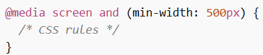
Basic Media Query Example
Example:
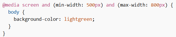
Range Example
Example:
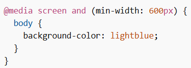
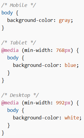
Responsive Design Example
Example:
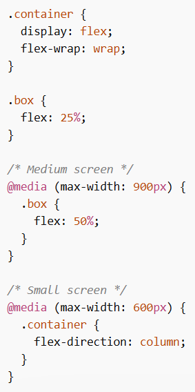
Layout Change Example (Columns)
Example:
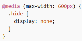
Hide Elements Example
Example:
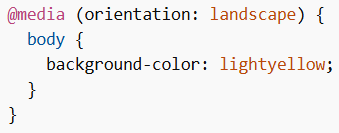
Orientation Example
Example:
Media Queries in CSS responsive web design ka core part hai. Yeh different screen sizes aur devices ke according layout aur styling adjust karne me help karta hai, jisse website har device par properly display hoti hai.