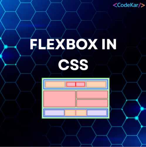
Flexbox in CSS ka full form hai CSS Flexible Box Layout module.
Flexbox in CSS ek layout model hai jo items ko container ke andar horizontal ya vertical direction me arrange karta hai, wo bhi flexible aur responsive way me. Flexbox in CSS use karke tum easily responsive layout design kar sakte ho bina float ya positioning use kiye.

Flexbox vs Grid
- Flexbox in CSS → one-dimensional layout (rows OR columns)
- CSS Grid → two-dimensional layout (rows AND columns)
CSS Flexbox Components
Flexbox in CSS me hamesha ye do cheezein hoti hain:
- Flex Container → parent element jisme
display: flexyainline-flexset hota hai - Flex Items → direct children automatically flex items ban jaate hain
A Flex Container with Three Flex Items
Neeche ek flex container ka example hai jisme 3 flex items hain.
Example:
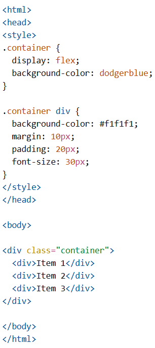
CSS Flex Container
CSS Flex Container Properties
Flex container ke paas ye properties hoti hain:
display→ flex ya inline-flex hona chahiyeflex-direction→ items ka direction set karta haiflex-wrap→ items wrap honge ya nahiflex-flow→ shorthand (direction + wrap)justify-content→ main-axis (horizontal) alignmentalign-items→ cross-axis (vertical) alignmentalign-content→ multiple lines ka alignment
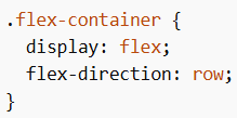
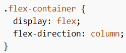
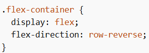
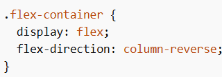
CSS flex-direction Property
Flexbox in CSS me flex-direction items ka direction define karta hai.
Values:
row(default)columnrow-reversecolumn-reverse
Example (row):
Example (column):
Example (row-reverse):
Example (column-reverse):
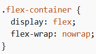
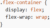
CSS flex-wrap Property
flex-wrap decide karta hai ki items wrap honge ya nahi jab space kam ho.
Values:
nowrap(default)wrapwrap-reverse
Example (nowrap):
Example (wrap):
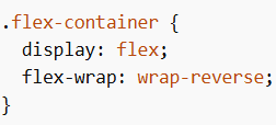
Example (wrap-reverse):
CSS flex-flow Property
flex-flow shorthand hai flex-direction + flex-wrap ka.
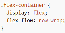
Example:
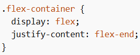
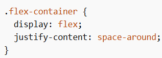
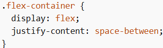
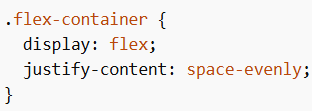
CSS justify-content Property
Flexbox in CSS me justify-content main-axis (horizontal) alignment karta hai.
Values:
flex-start(default)flex-endcenterspace-aroundspace-betweenspace-evenly
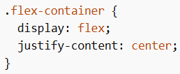
Example (center):
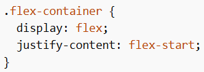
Example (flex-start):
Example (flex-end):
Example (space-around):
Example (space-between):
Example (space-evenly):
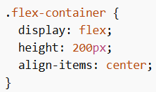
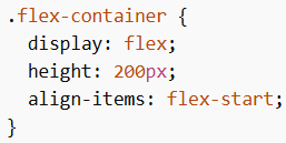
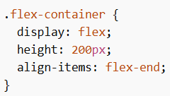
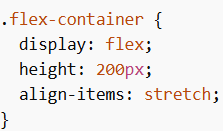
CSS align-items Property
Flexbox in CSS me align-items cross-axis (vertical) alignment karta hai.
Values:
normalstretch(default)centerflex-startflex-endbaseline
Example (center):
Example (flex-start):
Example (flex-end):
Example (stretch):
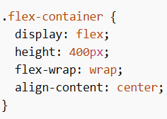
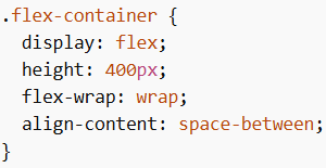
CSS align-content Property
align-content tab use hota hai jab items multiple lines me ho (wrap).
Values:
stretch(default)centerflex-startflex-endspace-betweenspace-aroundspace-evenly
Example (center):
Example (space-between):
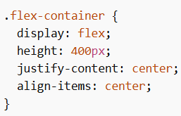
True Centering With Flexbox
CSS Flex Items
Flex container ke direct children automatically flex items ban jaate hain.
Flex Items Properties
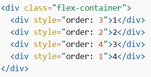
1. order
Display order change karta hai (default = 0)
2. flex-grow
Item kitna grow karega (default = 0)
3. flex-shrink
Item kitna shrink karega (default = 1)
4. flex-basis
Initial size define karta hai
5. flex (Shorthand)
6. align-self
Individual item ka alignment override karta hai
Responsive Flexbox
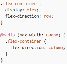
Example (Direction Change):
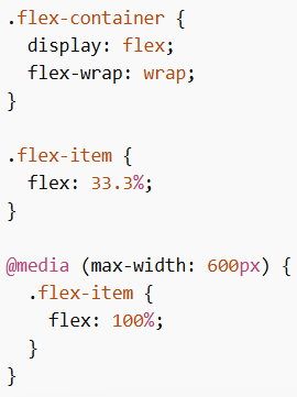
Example (Flexible Columns):
Responsive Image Gallery using Flexbox
Flexbox in CSS ka use media queries ke saath karke responsive image gallery banayi ja sakti hai jo screen size ke according adjust hoti hai.
Responsive Website using Flexbox
Flexbox in CSS ka use karke responsive website banayi ja sakti hai jisme navigation bar aur content automatically adjust ho jata hai different devices ke liye.
Flexbox in CSS ek powerful layout system hai jo flexible aur responsive design banane me help karta hai. Iske container aur item properties ka use karke layout, alignment aur spacing ko efficiently control kiya ja sakta hai.