Grid in CSS ek powerful grid-based layout system hai jisme rows aur columns use hote hain. CSS Grid developers ko easily complex web layouts create karne deta hai.
CSS Grid se responsive layout structure design karna easy ho jata hai, bina float ya positioning use kiye.
Grid vs Flexbox
CSS Grid ka use hota hai two-dimensional layout ke liye (rows AND columns).
CSS Flexbox ka use hota hai one-dimensional layout ke liye (rows OR columns).
Grid in CSS Components
Ek grid in CSS hamesha in components se milkar banta hai:
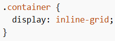
- Grid Container – Parent element jisme
display: gridyainline-gridset hota hai - Grid Items – Direct children jo automatically grid items ban jaate hain
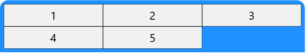
CSS Grid Example (5 Items)
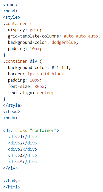
CSS Grid Container
CSS Grid container ke andar grid items rows aur columns mein arranged hote hain.
Jab kisi element ka display: grid ya inline-grid hota hai, tab wo grid in CSS container ban jata hai.
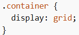
Display Property in Grid in CSS
Grid in CSS Tracks (Rows and Columns)
CSS Grid tracks define karte hain ki columns aur rows ka size aur number kya hoga.
Properties:
grid-template-columnsgrid-template-rowsgrid-template-areas
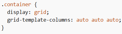
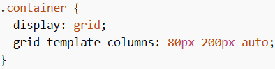
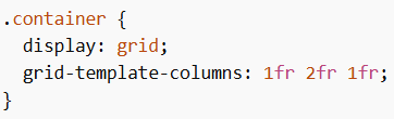
grid-template-columns
Yeh property columns ka number aur width define karti hai.
Common values:
- Fixed lengths (100px 300px 200px)
- Percentages (20% 60% 20%)
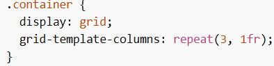
- fr unit (1fr 2fr 1fr)
- auto
- repeat()
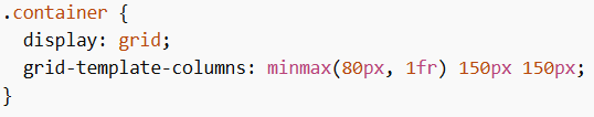
- minmax()
Equal Columns
Mixed Columns
Note: Agar items zyada ho jayein, toh automatically new rows create ho jaati hain.
fr Unit
fr ka matlab hota hai “fraction”.
repeat() Function
minmax() Function
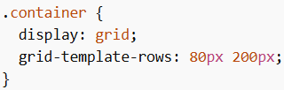
grid-template-rows
Grid in CSS Gap
Gap rows aur columns ke beech ka space hota hai.
Properties:
column-gaprow-gapgap
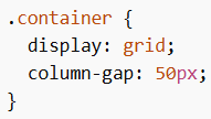
column-gap
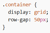
row-gap
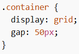
gap shorthand
Align Content
Properties:
justify-contentalign-contentplace-content
justify-content values
- space-evenly
- space-around
- space-between
- center
- start
- end
align-content values
- space-evenly
- space-around
- space-between
- center
- start
- end
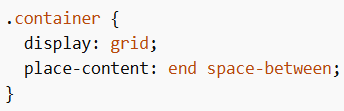
place-content
CSS Grid Items
CSS Grid items direct children hote hain jo automatically grid items ban jaate hain.
Sizing / Spanning in Grid in CSS
Properties:
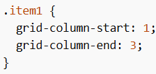
- grid-column-start
- grid-column-end
- grid-column
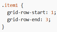
- grid-row-start
- grid-row-end
- grid-row
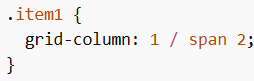
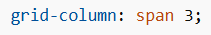
grid-column
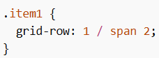
grid-row
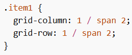
Combine row + column
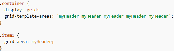
Naming Grid Items in Grid in CSS
grid-area
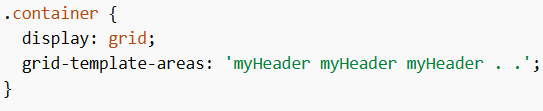
Empty space
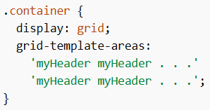
Multiple rows
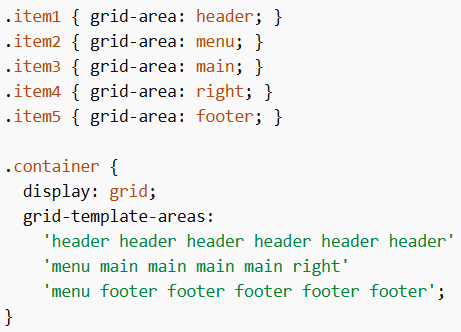
Webpage Template
Grid Items Alignment
Properties:
- justify-self
- align-self
- place-self
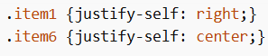
justify-self
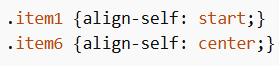
align-self
Grid Items Order
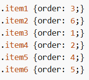
Note: Yeh sirf visual order change karta hai, DOM order same rehta hai.
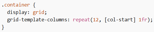
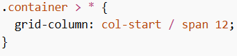
12-Column Grid
CSS Grid ka ek common use case hai 12-column layout.
Benefits
- Flexibility (12 easily divide hota hai)
- Responsiveness
- Efficiency
Create 12 Columns
Place Items
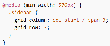
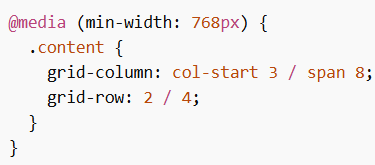
Media Queries with Grid in CSS
Mobile First
Tablet
Desktop
Note: Always fallback styles provide karo older browsers ke liye.