Multiple Columns in CSS ka use karke hum text ko newspaper-style columns me divide kar sakte hain. Isse content zyada clean, readable aur professional lagta hai, especially jab content lamba ho.
Ek hi paragraph ko multiple vertical sections (columns) me split kiya jata hai jisse reading easy ho jati hai.
CSS Multi-column Properties
Multiple Columns in CSS implement karne ke liye important properties:
column-count→ kitne columns chahiyecolumn-gap→ columns ke beech ka spacecolumn-rule-style→ columns ke beech line ka stylecolumn-rule-width→ line ki thicknesscolumn-rule-color→ line ka colorcolumn-rule→ shorthand (style + width + color ek saath)column-span→ element kitne columns cover karecolumn-width→ column ki ideal width
CSS Create Multiple Columns
Multiple Columns in CSS create karne ke liye column-count property use hoti hai.
Example:
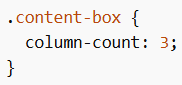
Isme content automatically 3 columns me divide ho jayega.
CSS Column Gap
Columns ke beech ka spacing define karne ke liye column-gap use hota hai.
Example:
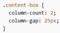
Isse columns ke beech 25px ka gap create hoga.
CSS Column Rule
Columns ke beech ek vertical dividing line add karne ke liye column-rule use hota hai.
Example:
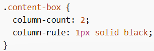
Yeh columns ke beech ek straight line show karega.
CSS Column Span
Kisi element (mostly heading) ko sabhi columns ke across dikhane ke liye column-span use hota hai.
Example:
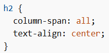
Heading poore columns ke upar ek line me display hogi.
CSS Column Width
column-width browser ko suggest karta hai ki har column ki width kitni honi chahiye. Browser khud decide karega kitne columns banenge.
Example:
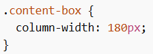
Isse layout responsive ban jata hai.