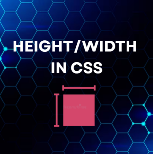
Height/Width in CSS ka use elements ki height (height) aur width (width) set karne ke liye hota hai. Isse tum webpage ke layout ko properly control kar sakte ho.
Height/Width in CSS – Basic Concept
height aur width properties element ki size define karti hain.
Important Note:
Height aur width sirf content area par apply hoti hain.
Ye padding, border aur margin ko include nahi karti.
Height/Width in CSS – Values
Height/Width in CSS me ye values use hoti hain:
- auto → default value, browser automatically calculate karta hai
- length → px, cm, em, etc.
- % → parent element ke according size set hota hai
- initial → default value set karta hai
- inherit → parent element se value leta hai
Height/Width in CSS – Examples
Example:
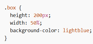
Is example me height fixed hai aur width parent ke 50% ke equal hai.
Example:
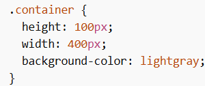
Yahan height aur width dono fixed values me set hain.
Min/Max Height and Width
Height/Width in CSS me tum minimum aur maximum limits bhi set kar sakte ho:
- min-width → minimum width
- max-width → maximum width
- min-height → minimum height
- max-height → maximum height
Using max-width
max-width property element ki maximum width limit set karti hai.
Iska use responsive design me important hota hai, kyunki ye element ko zyada bada hone se rokta hai.
Problem with width
Agar tum fixed width use karte ho aur screen chhoti ho jati hai, to horizontal scrollbar aa sakta hai.
Solution using max-width
max-width use karne se element screen ke according adjust ho jata hai.
max-width Example
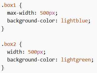
Yahan:
- box1 responsive behave karega
- box2 fixed rahega aur overflow ho sakta hai
Important Rule
Agar ek element par width aur max-width dono use ho:
- Agar width > max-width → max-width apply hoga
Example
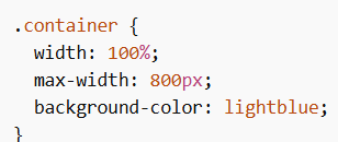
Yahan element full width lega, lekin 800px se zyada nahi hoga.
max-width Values
- length → px, cm, etc.
- % → parent ke according
- none → default, koi limit nahi
Height/Width in CSS layout control ka basic aur important part hai. Tum height, width, min/max properties use karke responsive aur flexible design bana sakte ho.