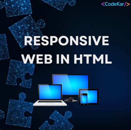
Responsive Web in HTML ka matlab hai aisi websites banana jo har device par properly display ho. Responsive web design automatically different screen sizes aur viewports ke according adjust ho jata hai, jaise desktop, tablet aur mobile phones.
What is Responsive Web Design?
Responsive Web Design (RWD) ka matlab hai HTML aur CSS ka use karke website ko automatically resize, hide, shrink ya enlarge karna, taaki website har device par achhi aur readable lage.
Isse users ko better viewing experience milta hai bina zoom ya horizontal scrolling ke.
Setting the Viewport
Responsive website banane ke liye har web page me viewport meta tag add karna zaroori hota hai.
Example:
Yeh tag browser ko instructions deta hai ki page ki width aur scaling kaise handle karni hai.
-
Without viewport meta tag: Page mobile devices par zoomed-out ya improper scale me dikh sakta hai.
-
With viewport meta tag: Page device width ke according automatically adjust ho jata hai.
Responsive Images
Responsive images wo images hoti hain jo browser ya device screen size ke hisaab se automatically adjust ho jaati hain.
Using the width Property
Agar CSS me width property ko 100% set kar diya jaye, to image responsive ban jati hai.
Example:
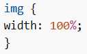
Is case me image container ke size ke according scale hogi, aur kabhi kabhi original size se badi bhi ho sakti hai.
Using the max-width Property
Agar max-width: 100% use kiya jaye, to image zarurat padne par chhoti ho sakti hai, lekin kabhi original size se badi nahi hogi.
Example:
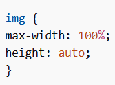
Yeh responsive images banane ka best aur common method mana jata hai.
Show Different Images Depending on Browser Width
HTML <picture> element allow karta hai ki different screen sizes ke liye different images show ki ja sakein.
Example:
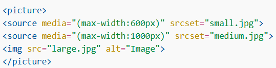
Isse browser screen size ke according best image choose karta hai.
Responsive Text Size
Text size ko vw unit se responsive banaya ja sakta hai.
vw ka matlab hai viewport width.
1vw = viewport width ka 1%
Example:
Jab browser window resize hoti hai, to text size bhi automatically adjust ho jata hai.
Responsive Web Design Frameworks
Responsive web design ko easily implement karne ke liye kuch popular CSS frameworks bhi use kiye jaate hain:
-
Tailwind CSS – Utility-based CSS framework
-
Bootstrap – Pre-designed responsive components aur grid system provide karta hai
Is tarah Responsive Web in HTML websites ko har device par flexible aur user-friendly banata hai. HTML, CSS, viewport settings, responsive images aur frameworks ka use karke developers modern aur responsive websites create kar sakte hain.