Image Gallery in CSS ek collection hota hai images ka jo web page par organized aur clean way me display hota hai. Yeh mostly responsive hota hai, matlab different screen sizes par properly adjust ho jata hai.
Structure of Image Gallery in CSS
CSS Image Galary banane ke liye basic structure hota hai:
- Ek main container (jaise
<div class="gallery">) - Har image ke liye ek separate container (jaise
<div class="gallery-item">) - Uske andar:
<img>tag (image ke liye)- optional description (
<div class="desc">)
Image Gallery in CSS Example
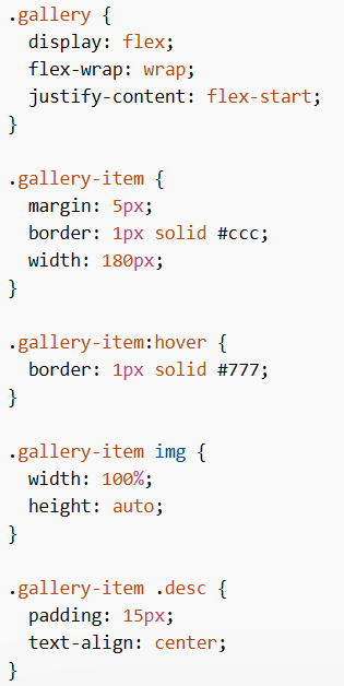
CSS Code
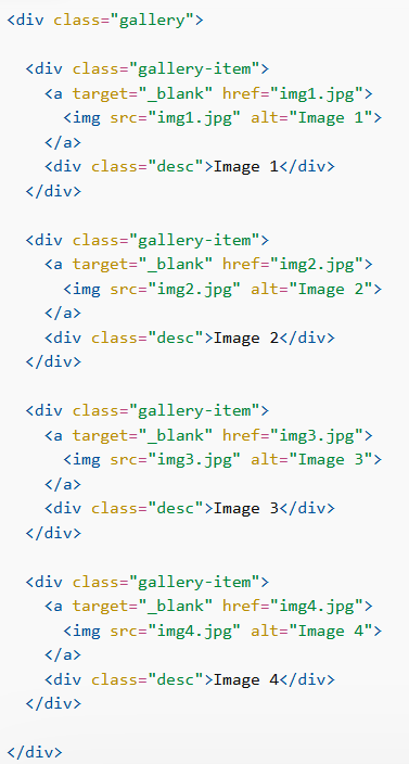
HTML Code
Explanation
display: flex;→ images ko row me arrange karta haiflex-wrap: wrap;→ next line me shift hone deta hai jab space kam homargin→ images ke beech gap deta haiborder→ image ke around border lagata hai:hover→ hover karne par border change hota haiwidth: 100%→ image container ke andar fit hoti haiheight: auto→ image ka ratio maintain hota hai.desc→ image ke niche text show karta hai
Tip: Image Gallery in CSS me display: flex use karna best hai kyunki yeh images ko rows ya columns me easily arrange karta hai.
CSS Responsive Image Gallery
Image Gallery in CSS ko responsive banane ke liye media queries use ki jati hain.
- Screen > 768px → 4 images side by side
- Screen < 768px → 2 images side by side
- Screen < 480px → images vertically stack (width: 100%)